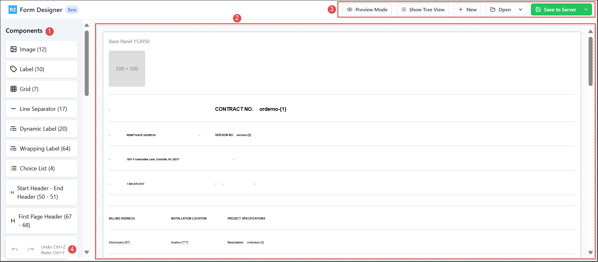
Upon clicking the R2 Launch pad> Maintenance> Form Setup> Form and Edit icon, you'll be directed to the Form Designer screen, where all the fields and components on the selected form are loaded in the sequence of left-to-right and top-to-bottom in the Designer area. Each component corresponds to the individual row in CSV format.
-
Components: Lists all the available component types used to design the print form. Know more about Components.
-
Designer area: This is the main workspace where you view, design, preview your form. Drag components from the left panel and drop them into the Designer area. Hovering over a component reveals action icons for further customization.
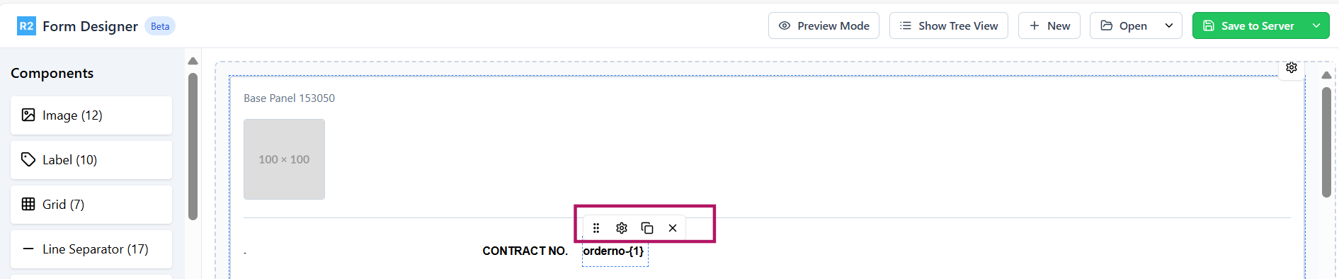
Figure 2.0: Action icons -

-

-

-

-
-
Tool bar:
-
Preview Mode: View how the form will appear when printed. This is a non-editable mode to verify layout. Any component placed beyond the width of the print orientation selected in the base panel i.e Portrait or Landscape will cross the red horizontal bar. Such components will not have proper placement in the print.
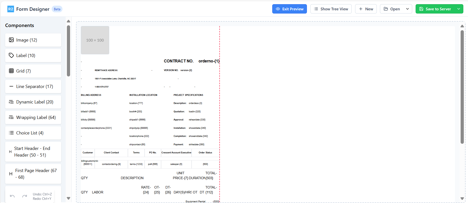
Figure 3.0: Print Preview -
Show Tree View: Displays the form components in hierarchical structure.
-
Click a component to locate it in the Designer area.
-
Use the

-
Use the

-
Use the

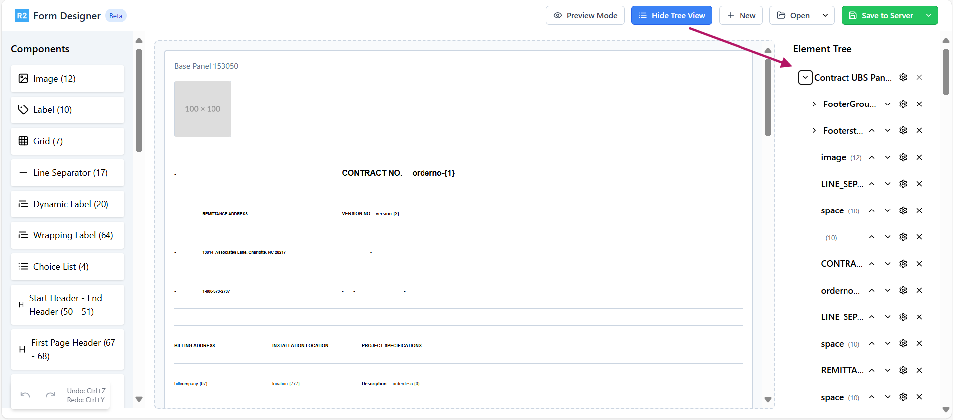
Figure 4.0: Tree view of the form
-
-
New: Creates a new form.
-
Open: Allows to access existing form. Use down arrow to select the form from local files or server storage.
-
Save to Server: Allows you to save the form to the server. Use the down arrow to download a local copy.
-
Discard: Discard option is enabled when you open/save the form from/to Server. It discards change and restores the previous version.
-
-
Undo/Redo
-
Use the Undo/Redo options to reverse or reapply recent changes
-
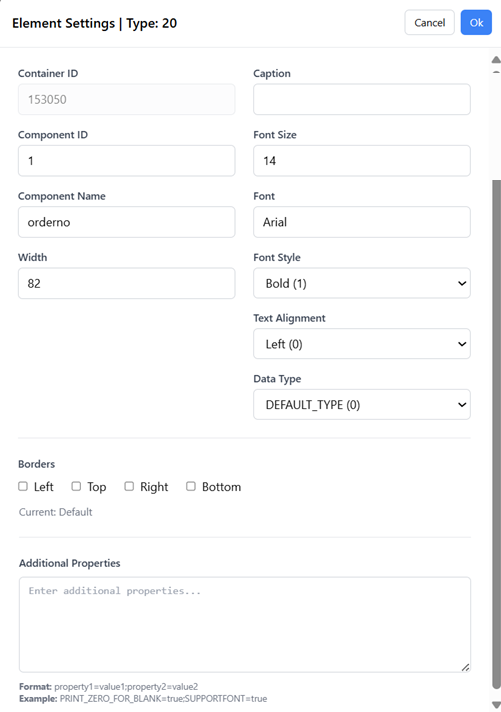
Element Settings
-
Container: ID of the parent component. For the Grid column components, it will be the Grid ID. Rest of the components will be showing the Form ID.
-
Caption: Label or text to be printed. This is applicable only for specific components (Label | Dynamic Label | Wrapping Label | Amount)
-
CID (Component ID): CID corresponding to the data to be printed if it is Component. If it is a grid component, enter Grid Panel ID. For more details, refer to CID master sheet.
-
Font Size: Determines the text size of the element.
-
Component Name: User-defined name to help identify the element.
-
Font: Specifies the typeface used for text of the element
-
Width: Defines the element’s width on the form.
-
Font Style: Determines text appearance like Bold, Italic, etc. Used for visual emphasis and hierarchy.
-
Text Alignment: Controls positioning of the content of the component. Options typically include Left, Center, etc.
-
Data Type: Defines the type of data the field accepts.
-
Border Settings: Controls the element's outer edge appearance like Left, Right, Top, Bottom.
-
Additional Properties: Specifies the custom properties. Please refer to the Property tab in CID_Master_ Reference.xls
Now that you have walked through the Form Designer Interface, let’s see how to edit the form